Vimperk
In 2020 I got invited by the city architect René Dlesk to participate in the invited competition to design the new logo and visual identity system for Vimperk in Czechia’s south. With my small team we ended up winning and our collaboration with the city is centered on creating the best example for a city’s visual identity on all levels. We develop custom applications that are well thought-out and produced in high quality with a significant local business participation.
Vimperk heraldry →

The logo is key
In the process of designing this identity I was looking for a simple strong form that can carry a lot of meaning for the city and for its people. The city analysis and research performed by Michaela Hečková and the genealogy study provided by Stanislav Kasík have given the creative process a solid ground with lots of elements to pickup. In the end the famous glory days of worldwide book printing in the history of Vimperk have become the strongest and proudest story.
V for Vimperk
The shape of the logo is based on the dominant V – the first letter of the city’s name.
Sports stripes
A racing car, a sports outfit, dynamics and motion. That is what stripes stand for here.
An open book
The V shape looks like an open book – a symbol of the city’s rich printing and publishing history.
V as number 5
This number represents the 5 pillars of the city’s identity: a medieval town for the future, city of sports, a gate to Šumava and a living city.
Books on a bookshelf
The repeating angled stripes remind of books on a bookshelf. Vimperk is a city of literature, education and knowledge-based economy.
A medal
The Vimperk lettering seemingly hangs off a band just like a medal would bringing in sophistication and decoration. Vimperk and its citizens are rightfully proud.
The triangle of V
The castle, the old town square and the main parking by the river Volyňka form the encapsulating triangle of the main tourist points of navigation.
Sovereignty
The dot at the end expresses the sovereignty of the city that is very clear about its identity. Vimperk knows where it is heading. It is confident. Full stop.
Winterberg
The double lines sort of remind of the letter W. It is an intentional link to the original German name of the city – Winterberg.
Typography
Clean, precise and perfectly legible modern typeface called Aeonik.
Logo variations
In most visual identities the logo exists in one or two versions and it is immediately accompanied by filler effects like patterns. For this system I wanted to let the logo play a much more flexible and prominent role and only use patterns and colors much further away from it. The logo has several versions that allow it to work perfectly in any kind of format and orientation without losing its image. Also there is a special ocassion version that incorporates the centuries old – but carefully revised – coat of arms. Very often you see these old symbols get sidelined by the contemporary redesigns and I don’t really agree with that. What bigger thing is there for a city than its centuries of history that produced it and its people.


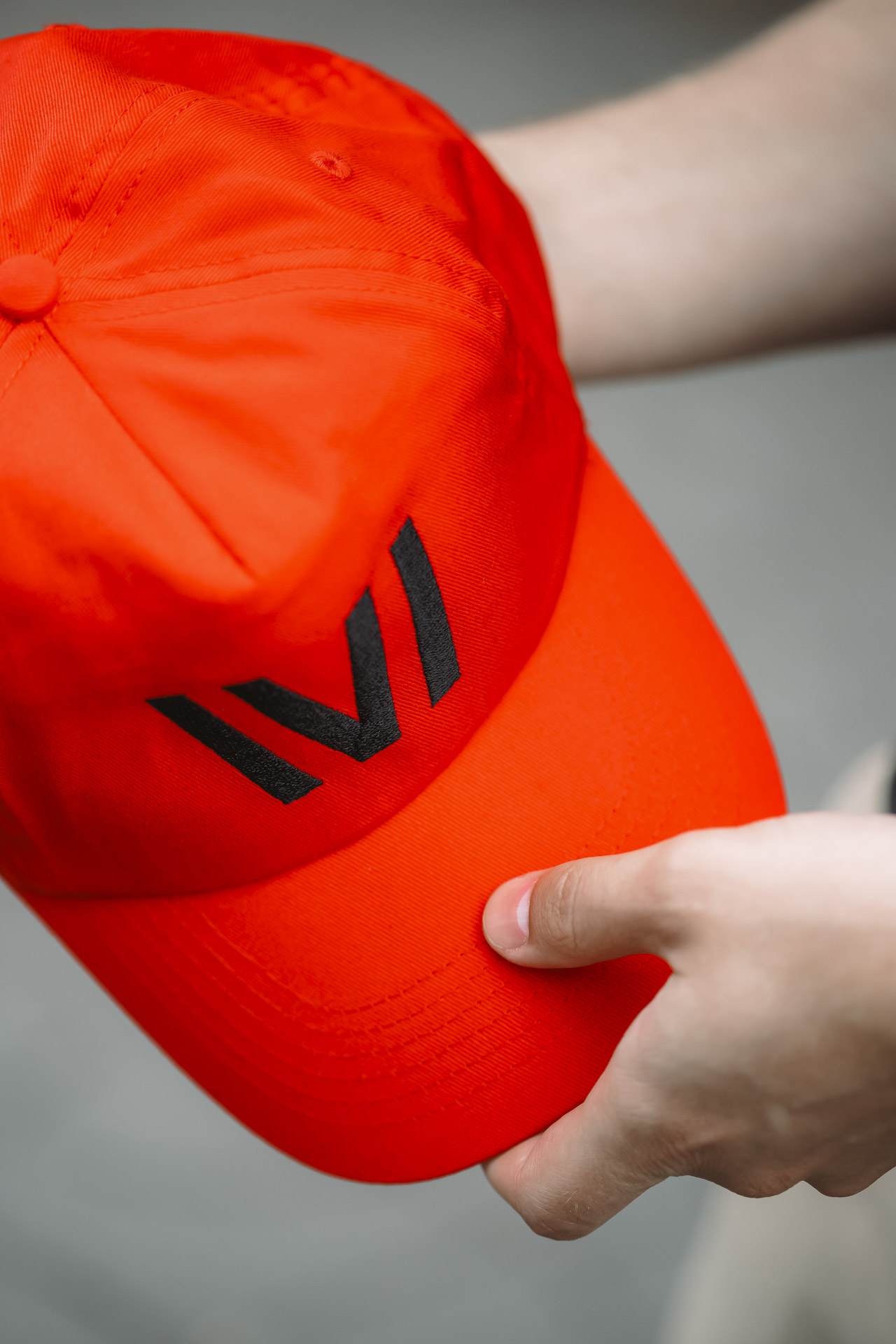
Make it wearable
All the applications we produce are first of all utilising the slightly more complex logo system and prove its strengths. The team at Vimperk is so keen at maintaining a high quality of all the products that bear the city’s insignia and I am so very glad about such a sophisticated approach on their side. When compared to the previous years they now produce much less items of representative merch but all is at a seriously higher quality. This involves us carefully selecting materials, sizes, t-shirt cuts for male and female contours and generally making sure these products actually work and people enjoy using them.


Aqua naturale
A custom commissioned set of a water carafe and glasses for the city and town hall offices. Simple functional shapes, perfectly produced etching on glass surface.


Cultured public space
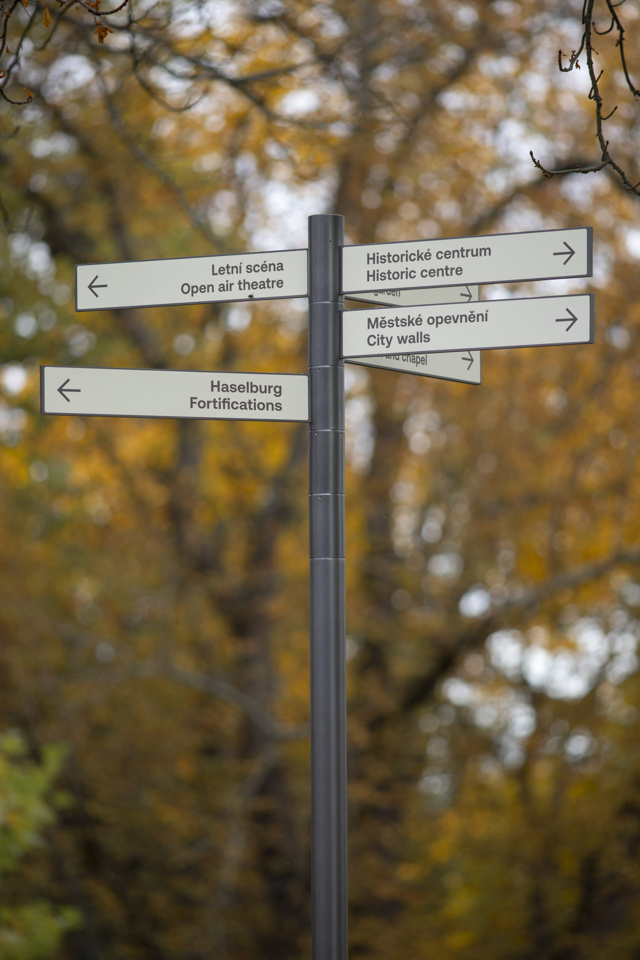
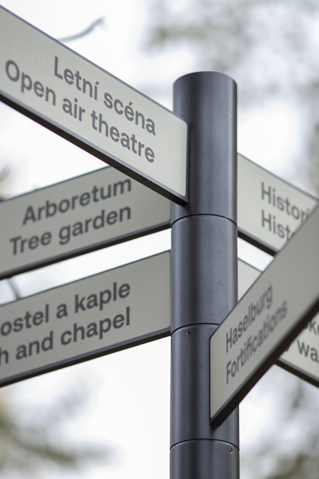
Next to print and merch the city identity extends into public space and physical designs. For me public space is a huge subject as it really is the last layer of influence on people. It is a zone of opportunity to cultivate the general public and create a lot of impact on everyone’s day every day. The navigation/info system is using a combination of hardware by mmcité and a custom infopanel construction designed by me together with the city’s architect René Dlesk. On top there is a tough custom-developed sticker recipe by Signpek. The result is a sleek and almost indestructible set of products that can handle the winters as well as the vandalism. The same materials and surface finishes can also be scaled for future applications. Visually it is an exercise in simplicity combining very considerate typesetting with a minimum of features and variations for a calm and easily integrated look. And as always there is no back side to these designs – perhaps the welcome signs look even better from the back than some other ones look from the front.


Project info
Graphics
Client
The city of Vimperk
Creative direction, graphic design, product design
Matej Chabera
Collaboration
Michaela Hečková, René Dlesk, Stanislav Kasík, Vimperk town hall team
Models
Tereza Polanská, Ondřej Kohout
Manufacturing
BM Promotion, Signpek, mmcité
Photography
Chabera studio
Year
2020 – 2022
