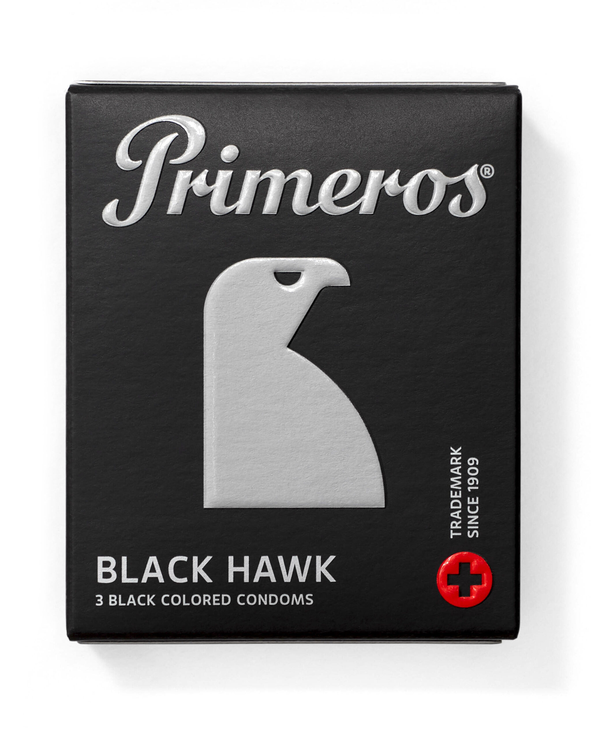
Primeros Blackhawk
This one is the most special for me from the whole 9 characters. The black condom. For some people it is too much, most find it a rather cool change. It is such a visually balanced package of black, grey, matt and gloss. It is the symbol of someone who hunts at nightfall just like the hawk.
primeroscondom.com →
Primeros Innocent →
Primeros →


Ultimate choices and a complete unity inside out
The shades of grey unite this product and all its parts. Just the traditional medical cross is in Ferrari red. The sides of the 3-pack and 12-pack feature a gloss pattern that is replicated on the inside of the box. Just the amount of complex polygraphic techniques layered on this product and the attention to all aspects make it completely unique in this market. Even the condom foil itself is character-specific with its own design.
Within the design process that combines graphic and product design in a unison we also got to choose the specific colors and flavors of the condoms themselves. The whole range explores several directions, but Blackhawk is the only one combining black latex with the neutral fresh scent.

Custom foil graphics for each condom line in the collection. Mission accomplished.

Seal of authenticity of a brand older than Durex.

The 12-pack with a built-in scratch game.
A good condom pack opens with one hand. In the dark …


7 technological layers aligned
These packs use some of the most intricate polygraphical technologies. The inside of the pack is printed with a custom pattern and the character claim. The outside graphics has a layer of partial gloss lacquer to highlight features and decorate sides of the pack. On top of that goes the luminescent layer that glows in the dark, the hot metal stamp of quality on the back of the pack, the deep emboss of the main features and finally the whole pack gets cut out, perforated and pre-folded with one die.

A — cutting die
B — emboss
C — metallic hot stamp
D — layered luminescent ink
E — partial gloss
F — ofset CMYK and Pantone colours
G — inside of box CMYK and Pantone colours

Blackhawk caught in-between production steps.

Naturally dirty. One of the final aquarels over tech drawing on the way to the 9 symbols for all Primeros product lines.
Project info
Graphics
Client
Primeros s.r.o.
Project creative direction, graphic design, vector work, campaign creative direction
Jakub Korous
Project creative direction, graphic design, sketching, vector work, packaging design, packaging prototyping, studio photography creative direction
Matej Chabera
Typography / logo redesign
Tomáš Brousil
Collaboration
Marek Dvořák, Primeros team
Consulting
Petr Haškovec
Visuals
Chabera studio, Filip Beránek, Nikolas Tušl
Awards
Red Dot Design Award 2017, Packaging of the Year 2018, Czech Grand Design – Designer of the Year 2017
Year
2017
