A lion reborn
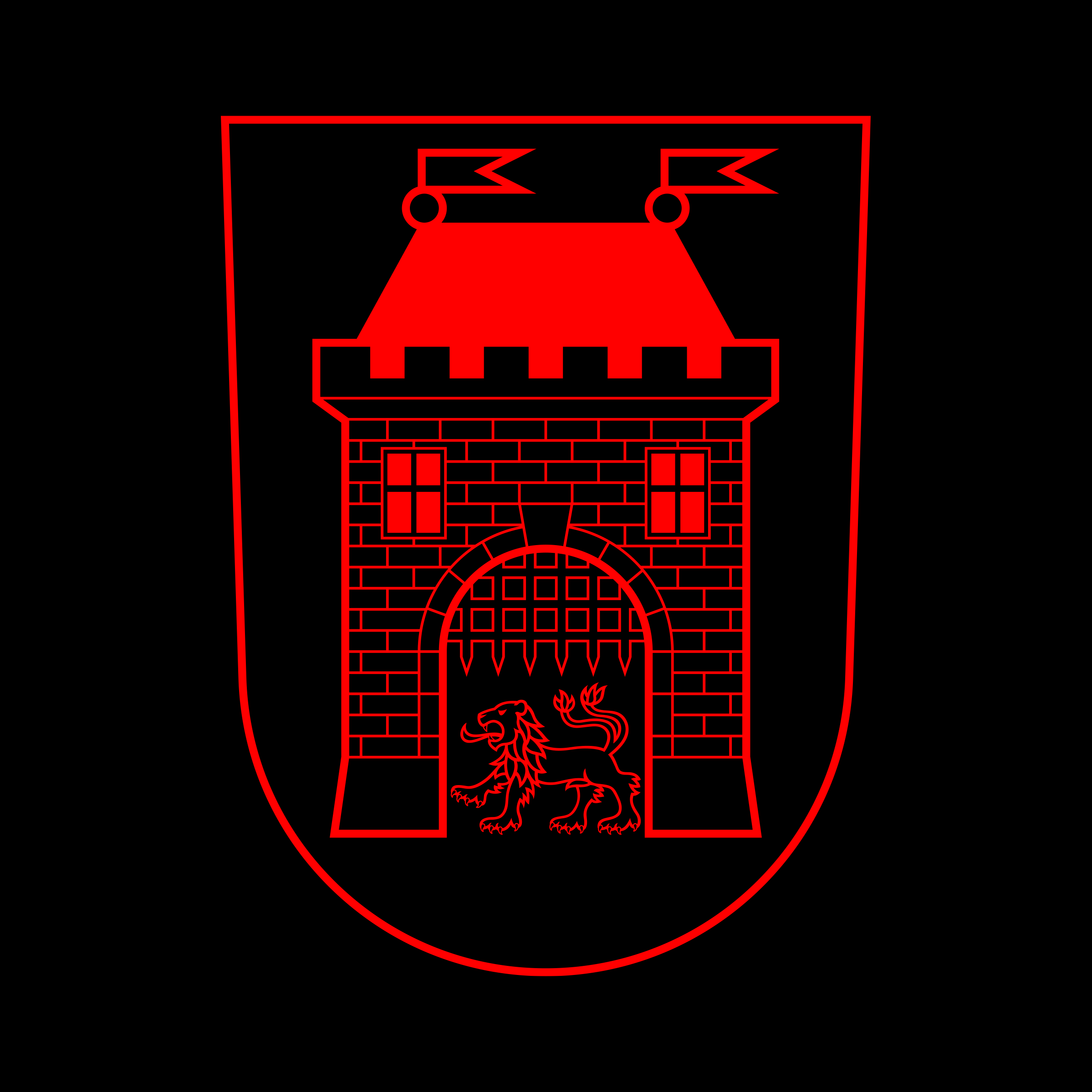
The lion on the coat of arms of the city of Vimperk in Czechia dates its origins to 1537. Through the coming centuries it has witnessed many interventions and alterations that deviate it from the strongest tradition and the rules of heraldry. I was asked to rework the lion and the coat of arms to give it a permanent strong representative presence.
Vimperk visual identity →
Before →


The complete picture
I have a special appreciation for heraldry, for continuity and graphic symbolism that bridges centuries. In line with my obsessive methodology standards I have started this by bringing in a wonderful expert in the field from the Czech Genealogic and Heraldic Society in Prague, Mr. Stanislav Kasík. His research and analysis of the coat of arms has brought to light many interesting aspects. During the Second World War the productive offices of the Germans have made attempts to change the leaping lion to a running dog. Thankfully they did not get very far with it. Eventually we managed to put together the correct heraldic description, gather sources and I could begin to see what needs to happen to make this a proper lion again.

In its new version the lion also received a previously unused option – the lion head. It is a great energetic compact symbol that finds many applications within the city’s visual identity system.
Old roots & new visions
It never was an anatomically correct lion, it is a heraldic figure and its forms are dictated by established traditions more than biology. My approach to the whole subject was to bring in as little change as possible, to stay true to heraldry but to bring in some contemporary influence. Vimperk is a city with a rich history of book culture and trade but in its current life it is so keen on its sports as well. So the contemporary influence surely have been sports team symbols from around the world. I wanted the lion to stay honest to its late medieval roots but to be a symbol that current and future generations can recognize and identify with. A symbol they can relate to and begin to see as something strong and meaningful that represents their city.


Tower of (symbolic) power
Together the lion and the tower form a strong partnership. As heraldry prescribes they have an optically matching line thickness but the architectural symbol is more geometric while the lion is more organic. Of course I tried to make the lion strictly out of one thickness of line but it felt too digital. The lion needs to have more fluency in its lines. The teeth and the claws are done in a second line thickness as they need to maintain a clearly visible fill down to small sizes.
Project info
Graphics
Project under full supervision and with official approval of the Czech Genealogic and Heraldic Society in Prague.
Client
The city of Vimperk
Creative direction, graphic design, sketching, vector work
Matej Chabera
Heraldic & genealogic research, consulting
Stanislav Kasík
Collaboration
Michaela Hečková
Visuals
Chabera studio
Year
2020 – 2022
