LUGI visual identity
Czechia’s LUGI furniture maker is a top-tier wood furniture producer famous for their combination of exquisite human craftsmanship and modern technologies in shaping and surfacing wood and other interior furniture materials. With Jakub Korous we were invited to design a complex visual identity system that continually evolves.
Logotype & tree
The LUGI logotype is enclosed in a pill-shaped outline to create a stamp effect. For a manufacturer aiming at the very highest levels of wood craftsmanship in furniture it functions as a seal of quality. It is a confirmation of the values of the brand. It has a stencil version as well that is used to spray-code packaging etc. The minimalistic tree symbol is a floating visual accessory that signifies the close ties to nature and natural materials that LUGI respects and promotes.

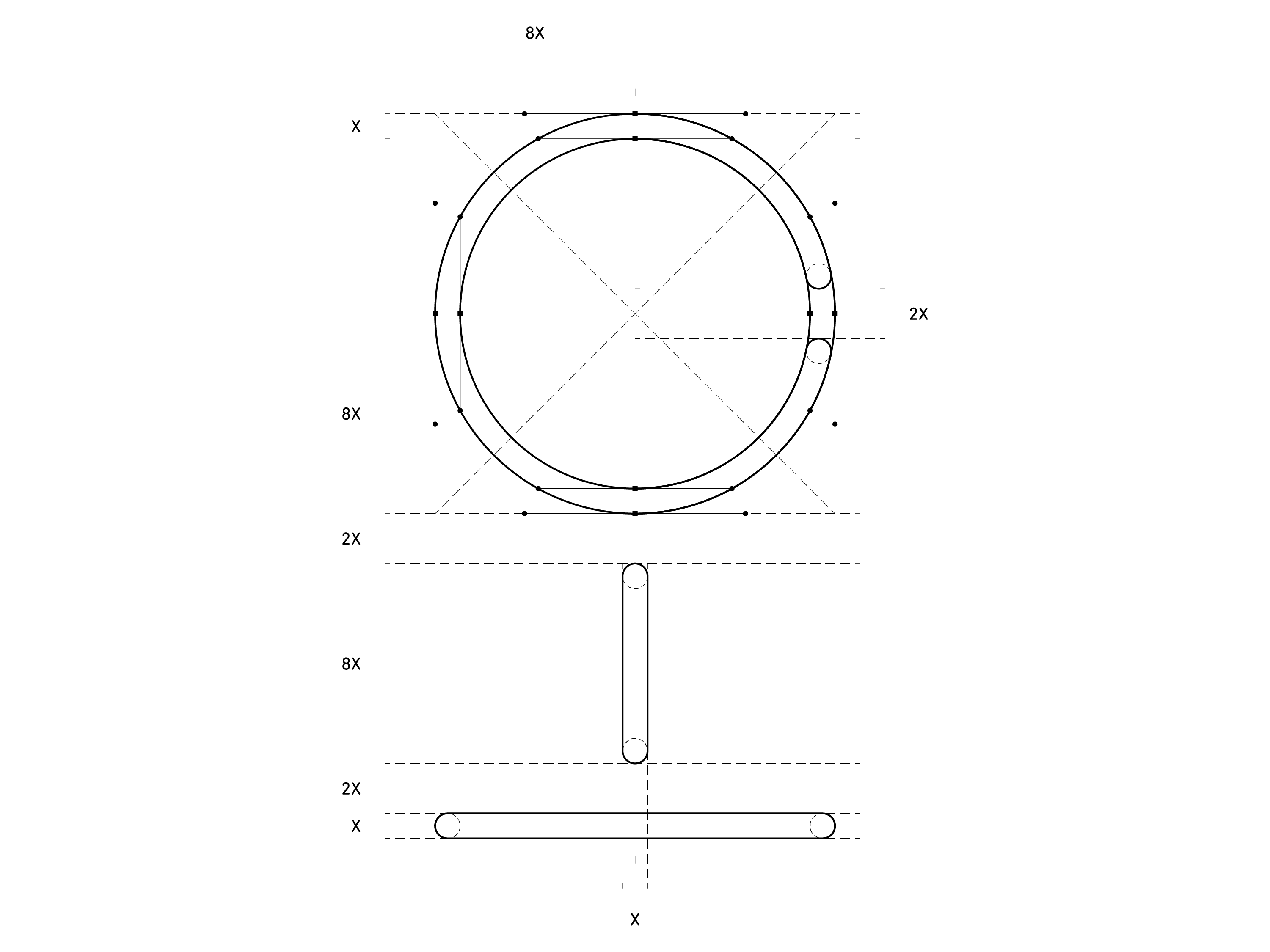
Inner logic.
Components.
Systematic variations.


Pantone Cool Grey 10 C
Pantone Green RYB 368 C
The grey is here to create a technical vibe with a slightly lower contrast than black/white would carry. It is more gentle and fits greatly with the natural wood tones omni-present in LUGI’s presentation that also don’t carry maximum contrasts. The green is an obvious nod to the love the company has for nature and natural materials. It is an inviting color and one that highlights important values like sustainability and most importantly for a wood manufacturer – a perfect wood waste management.
DIN Next LT Pro
DIN Next LT Pro is a typeface family developed by Linotype and is inspired by the classic industrial German engineering designs, DIN 1451 Engschrift and Mittelschrift. Machines, industry, perfection. That is also what we want the viewers to feel from all LUGI’s output. The clarity and technical simplicity of these sharp and round sans serif typefaces is a good balance to the raw planks of wood that LUGI keep in their wood-ageing vault.
Applications
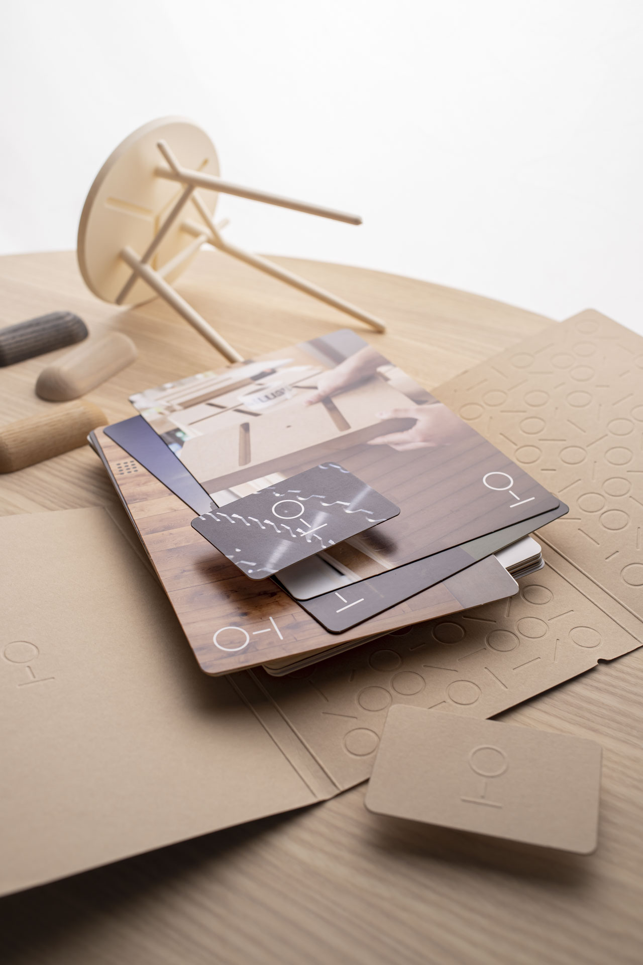
For this project we designed a very broad range of applications all based on systemic fonts, colors and brand features like certain type of product and interior photography and accent on craftsmanship before technologies. We wanted to express the natural wood look and feel in the paper products and the embossed logos and patterns into Colorplan’s Harvest paper worked just ideally. These exclusive paper products radiate the same quality and attention to detail the brand promotes. I am certain that this is the best way to speak about brand values – by making them happen. The careful attention to colors and materials continues across all other products like compliment cards, custom envelopes and portfolio folders.
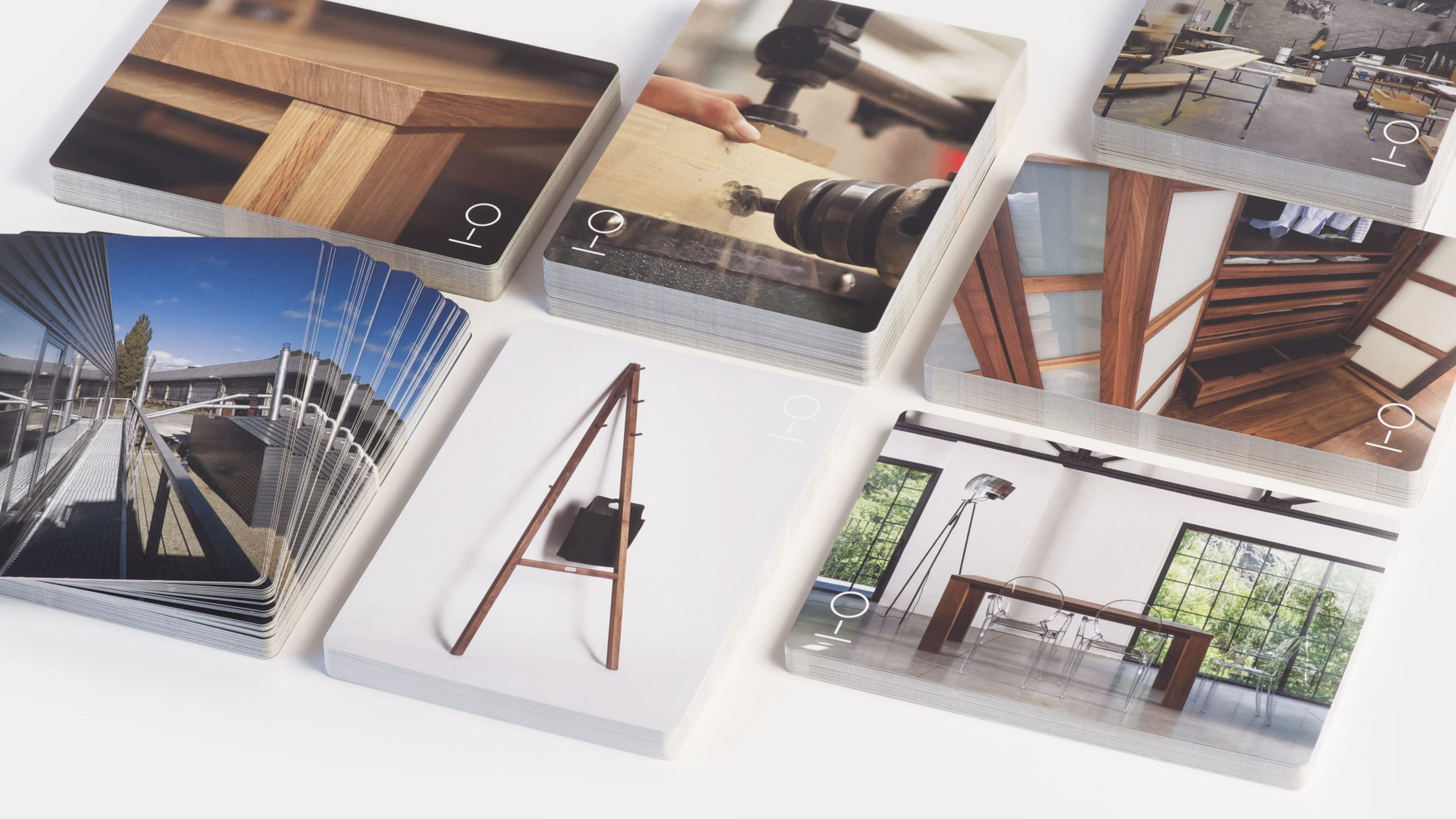
We curated a selection of A5 portfolio cards that best represent the LUGI range and that serve as inspiration for new projects and new clients.

This happens very rarely but here it did. We designed a custom cut for the C4, C5 and DL envelope formats.
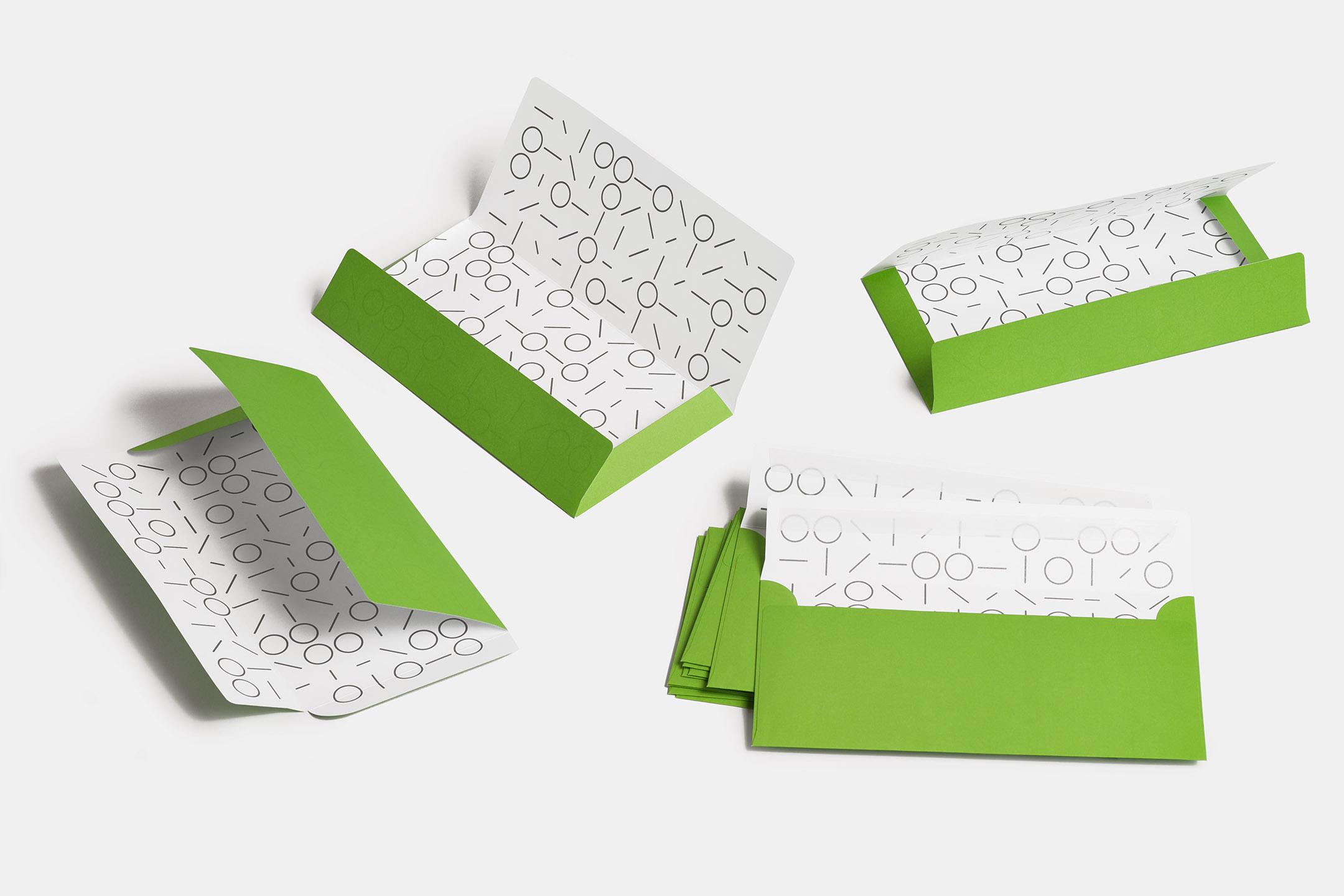
DL envelope inside pattern – opening the LUGI envelope is always an occasion.


Symbol on the front – the story / mission on the back.

The tree symbol is silkscreened onto sweatshirts.
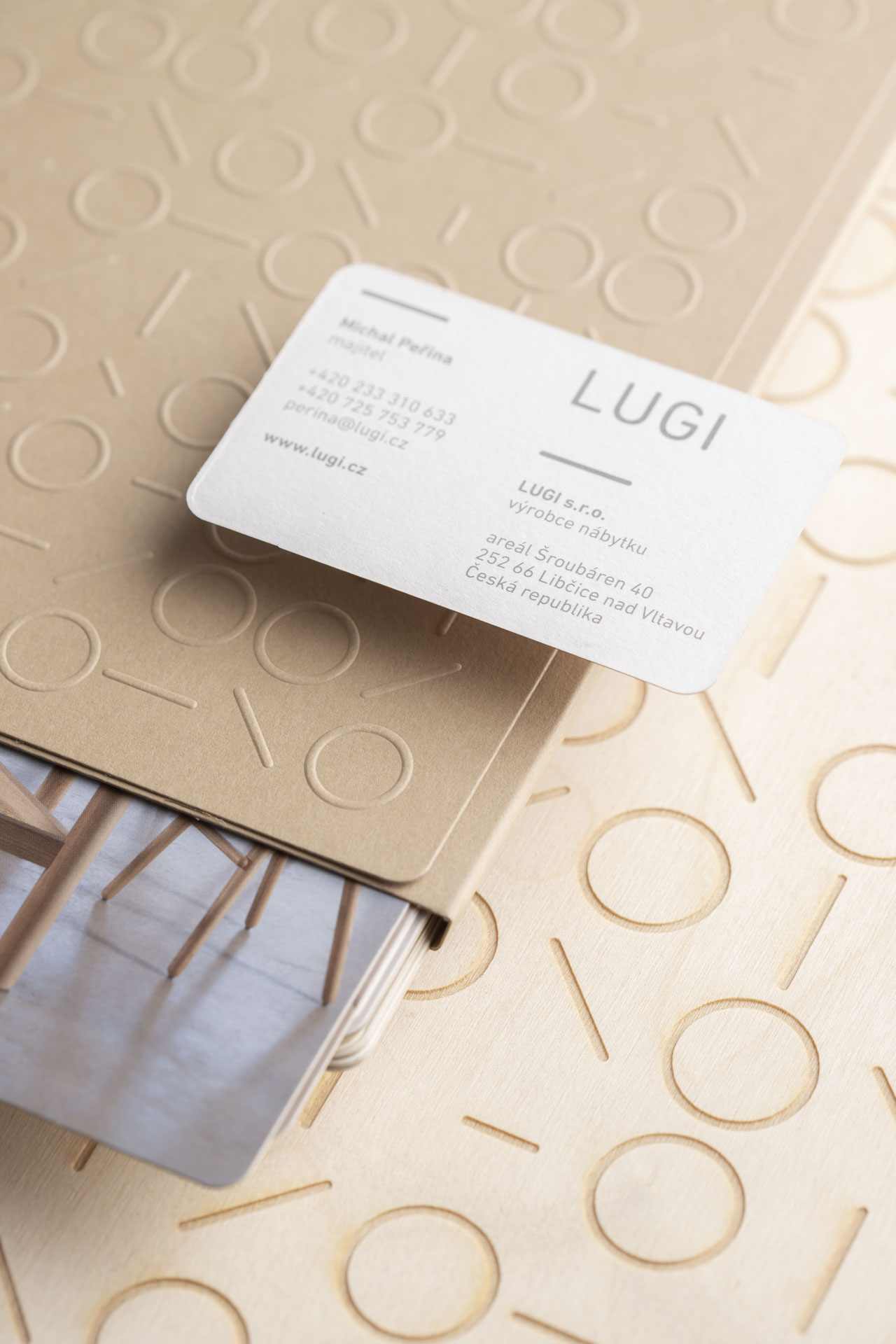
All this paper magic is courtesy of Ateliér Haškovec.
There are two types of business cards. The basic one for general employees has a person-specific photo on the a-side. The special one designed for the key people in the company features an emboss of the LUGI tree and a duplex paper construction that hides the back side of the pressing. The text side is ofset-printed in true Pantone values. All papers are the legendary Colorplan™ by UK’s G.F Smith.

The A4 notebook features a grid pattern chosen specifically as it aids the carpenters in sketching the specific shapes of interiors as they take measurements in customer’s spaces.

All grey colors are actual Pantone 10 C cool grey.


The notebooks are actually used in the internal creative processes of the company, they are not just a customer gift.

The vast array of A5 cards that comprise the portfolio is just a very unique way of doing a company catalog. It is a new composition every time for every client. The sales representatives hand-select a list of cards that fit the context, fit the client and the project. This way the attention during meetings is not wasted on unwanted content.
Project info
Graphics
Client
LUGI furniture maker
Creative direction, graphic design, product design, ideation, product development, material technologies, prototyping
Jakub Korous, Matej Chabera
Production
H.R.G. Litomyšl, Ateliér Haškovec
Photography
Chabera studio
Year
continual since 2011


